White House Logo Breaks Design Trends
The White House is making many changes and addressing the nation’s great challenges
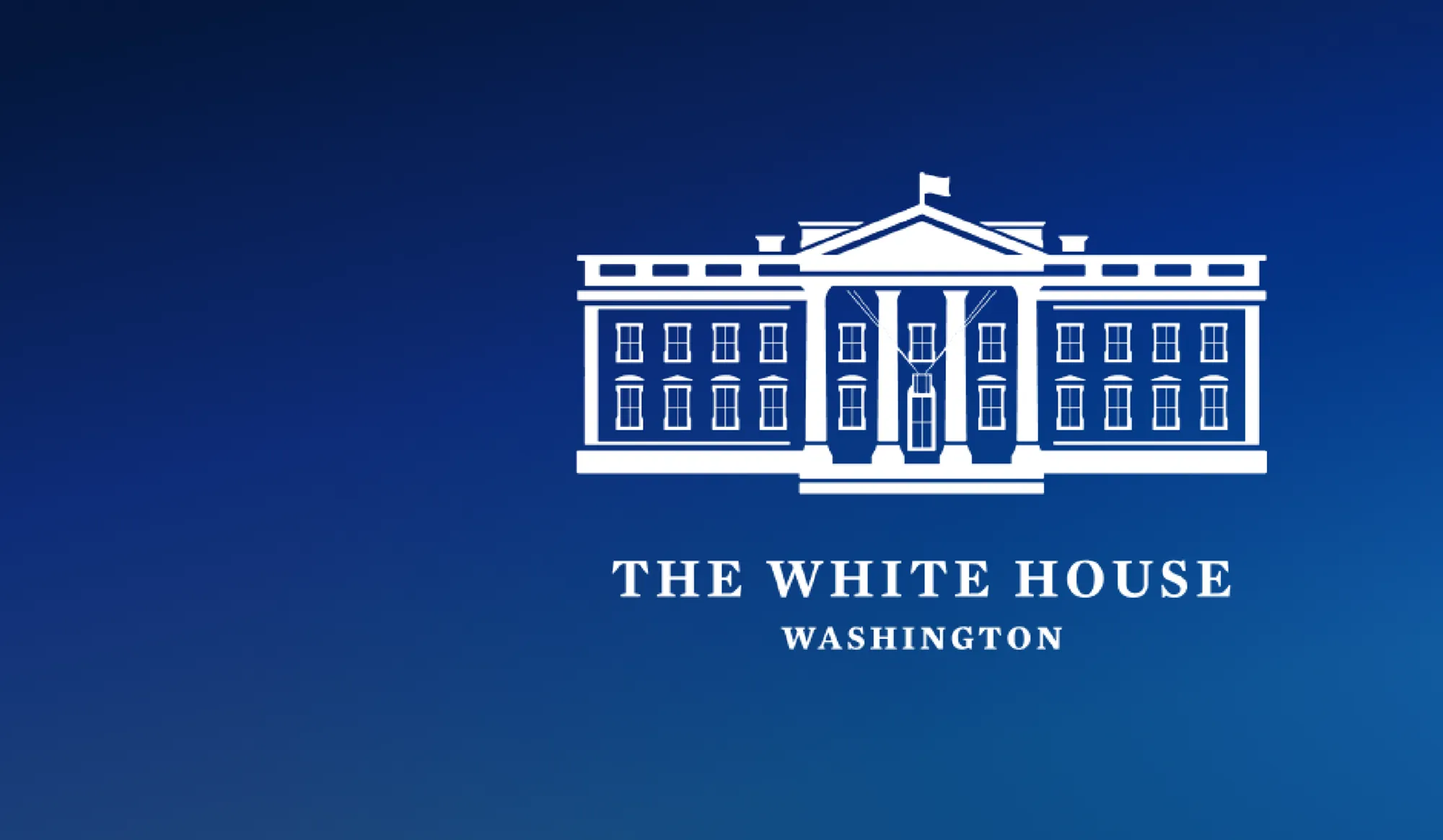
The White House, with the start of the new administration, is in the process of making many changes and addressing the nation’s great challenges. While not a matter of national security, there’s another major project the Biden administration was hard at work at behind the scenes and executed flawlessly. It quietly debuted a subtly redesigned logo – something that a new administration often does to differentiate itself from the previous one – but this one stands out in another way, too.
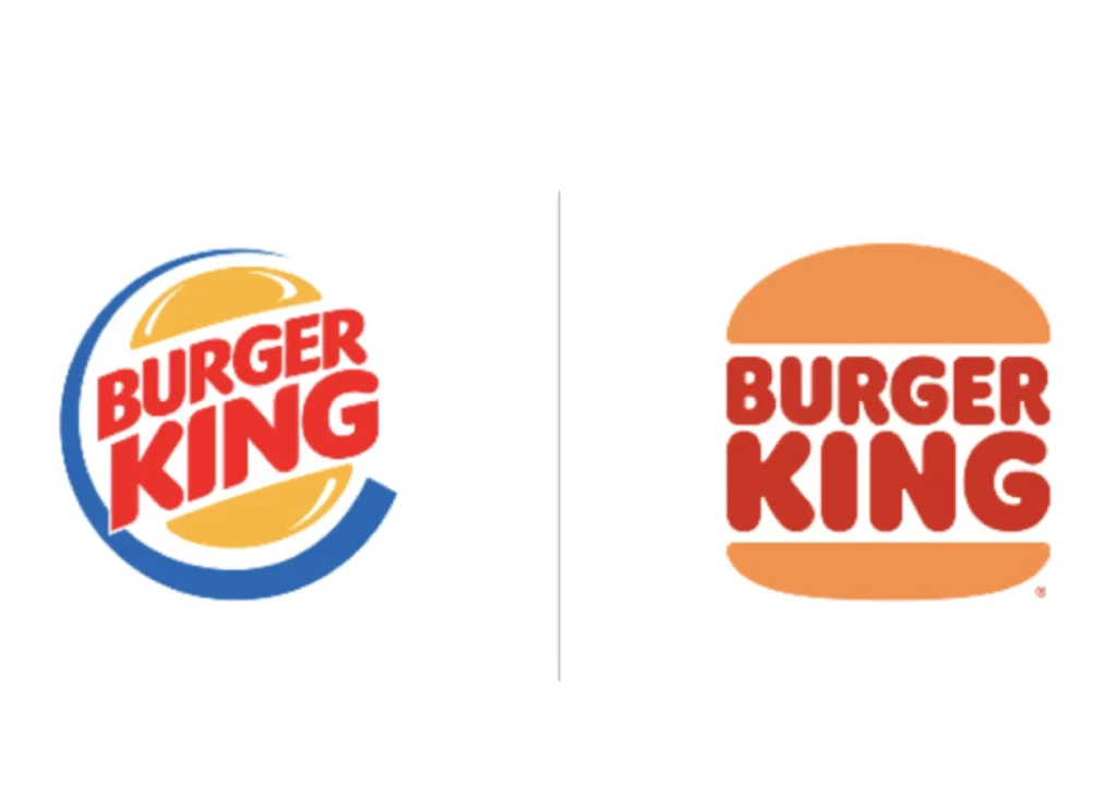
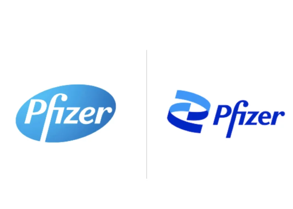
Throughout 2020 and now into 2021, we’ve largely seen company rebranding gravitate towards flatter, simpler logo designs and color palettes. Burger King, Pfizer, and Pringles are all examples of high-profile companies that have embraced the trend of overly simplified designs with minimal texture or details.
The Biden administration’s choice stands out because the new White House logo completely bucks that trend, instead offering more fine details. And, it has succeeded.
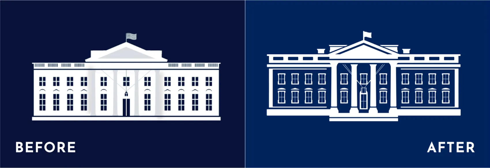
What makes it a well-executed and appealing design is the way the new logo highlights the actual structure of the White House, which allows it to be easily recognized even when it’s sized down. Interestingly, these types of fine details are exactly the elements that designers tend to frown upon and are removing under current design trends in order to accommodate for resizing on collateral and for digital platforms. It also contrasts with the previous administration’s version, which was an inverted silhouette that didn’t translate as well in a smaller format.
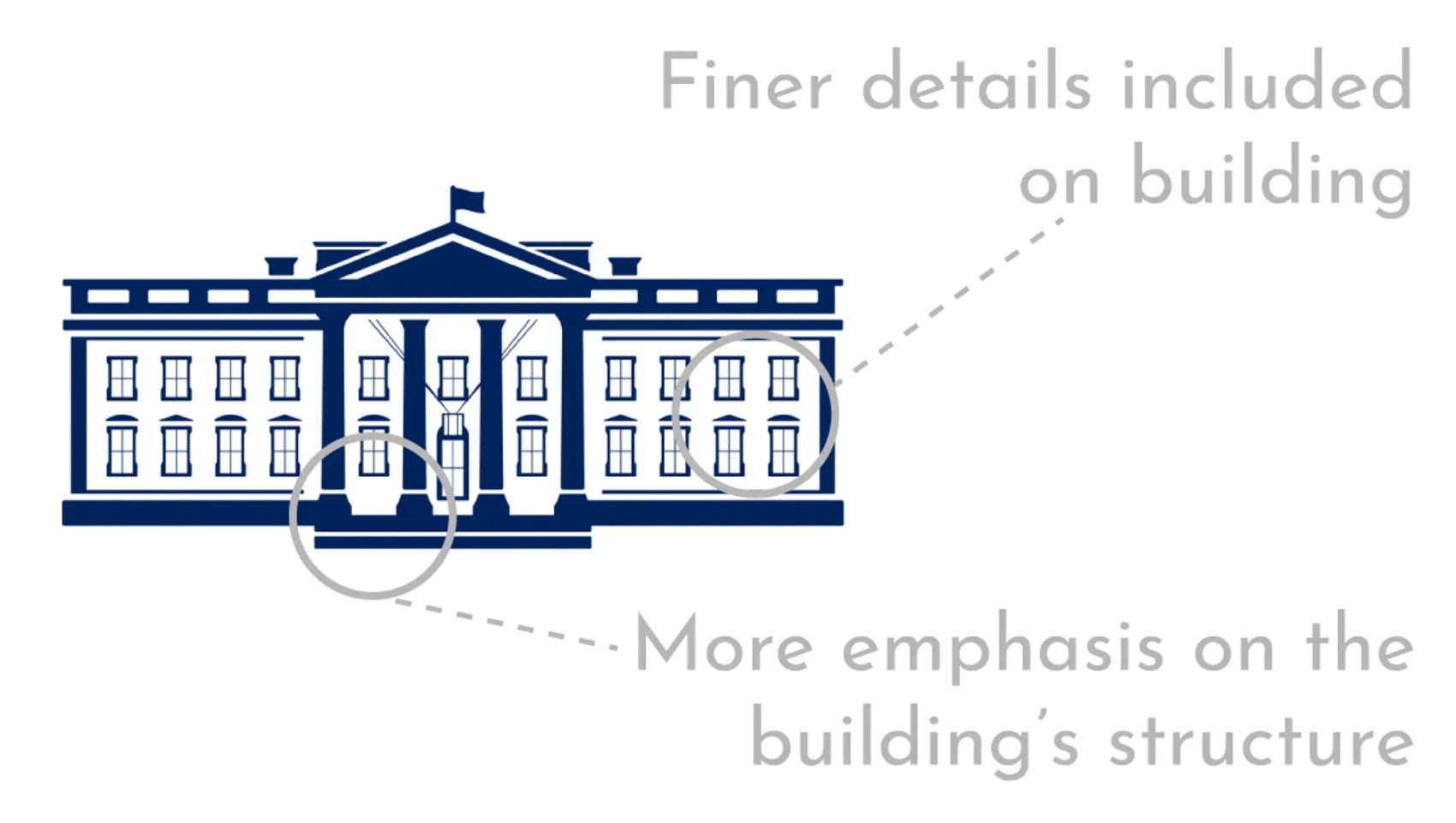
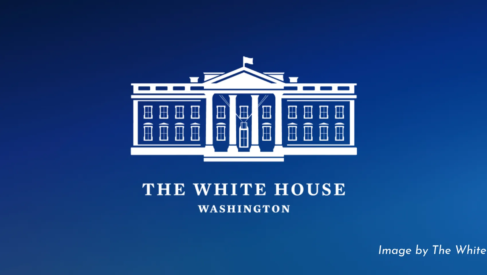
Instead of being muddled when resized or feeling old fashioned, the addition of finer building structure details instills a sense of tradition, while the overall look simultaneously ensures a modern aesthetic. It’s a smart, well-designed logo for one of the most important (and recognizable) brands in the world.
The design team continued to push the boundaries of current design trends through other marketing materials. Notably, the website challenges standard web design practices such as rounding image corners, a move most designers would consider dated, but somehow seems to make The White House feel more approachable to the everyday person.
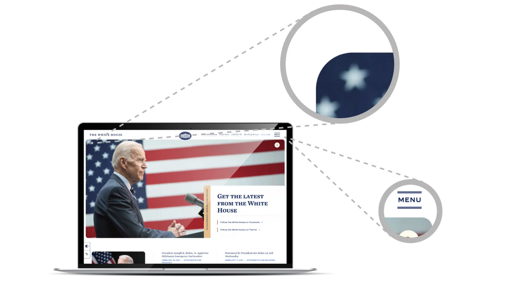
- Hamburger menu features thin decorative lines
- Images are showcased with rounded corners
- Website utilizes serif fonts

2020 certainly challenged everyone’s sense of normalcy, but with 2021 there is a renewed hope of returning to people and places we love, embracing new challenges, and starting fresh. It’s also the year for companies to embark on a rebranding journey to distinguish their unique brand from the rest.”
-Joseph Soto, Associate Director, Creative Services
This shift in design signifies that now is the time to do something different with branding. Nickerson’s full-service agency is equipped to assist your company in refreshing its graphic presence and helping to tell your story through a beautifully designed logo, website, brand package, and brand standards to help your business grow.


